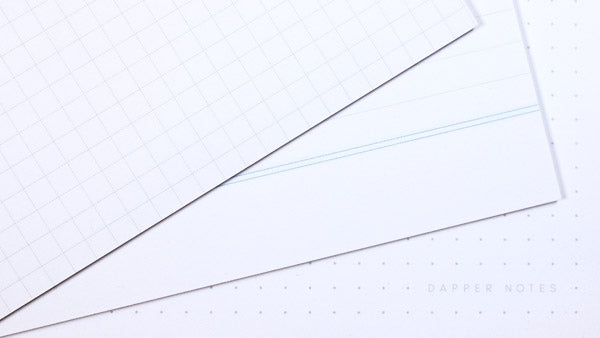
Last month John Morris posted a poll on two stationery Facebook groups. He was curious about everyone's paper preferences, and asked what pattern everyone enjoyed having on their pocket notebooks, if at all.
As a pocket notebook maker I was naturally curious to see the results, and was happy to learn that opinion was pretty much in line with what I knew all along.
I ran a poll myself a year or two ago, but it was on a much smaller scale. This time around John garnered a total of 942 responses with the following results:

Observations
Most people clearly prefer seeing something on their notebook pages. This makes sense because having a guide for writing and sketching helps keep things neater on the page. Creatively speaking, it's also nice to start with a page that isn't literally blank. Still, roughly ten percent prefer blank pages, which is a good thing for me to keep in mind.
A large majority strongly prefer dot grid and graph. I personally fall into the camp of dot grid: It has enough structure to work for writing, wireframing, lettering, and even drawing without imposing a rigid grid structure like graph paper does.
I was surprised to see so many voting for lined. Past comments and conversations impressed upon me that even journaling users don't love lined paper. I'm happy to see that there's still a sizable number of you who enjoy using it.
How does Dapper Notes compare?
Seeing these two polls had me wondering how my own notebooks measured up against your preferences. So I tallied up all of the Bookhead Club editions and came up with the following:

These results were a little surprising to me. I'd honestly thought that many more dot grid editions were created than the tally shows. I think this is in part due to the fact that the first few runs were made only using graph paper. It wasn't until the Summer of Sketching edition with Eric Friedensohn that I started using dot grid and other paper styles. That was a year-and-a-half into making Dapper Notes, so the high bias towards graph makes perfect sense.
There were also a few editions that used half graph and half blank (and also half dot grid and half blank), so for each of those I marked the edition as ½ of each, as opposed to "other". This brought up the percentage for both graph and blank papers used.
I'm happy to see that my use of lined paper lines up (pun intended) with John's poll results.
What about other Dapper Notes?
That first chart was only for Bookhead Club editions, which are not the only notebooks I've ever made. So I made a second count of all standard-sized Dapper Notes. This includes the Bookhead Club editions, the Little Monsters, Craft 3-packs, and all other notebooks that are sized 3.5 by 5.5 inches. The count does not include the large and smaller editions, since those are mostly offshoots of regular-sized notebook editions.
Here's what the final tally looked like:

As you can see, the total count is nearly identical to the first chart, which means that I'm pretty consistent with my paper selections.
Final takeaways
What does this breakdown mean for future Dapper Notes?
I will keep on prioritizing both graph and dot grid paper for future releases, with a slight preference towards dot grid.
You will occasionally see lined paper editions, and I'll probably create a handful in lined as part of an edition, and not necessarily for the entire run. For example: the upcoming 28th Bookhead Club edition (not yet released at time of publication) is largely made using dot grid paper, but about 20% of them were made with lined paper. So if lined is your jam, you'll have a chance to stock up.
Blank editions will make an appearance, but with less frequency. I may go with the lined paper approach and create a subset of some future editions with blank paper. TBD.
Let me know what you think
Do you feel strongly about your paper type one way or another? I'd love to hear about it. Send me a message, and let's chat.


